Resources
This is a proposal for a specification to handoff designs from design to engineering. See Design 🤝 Engineering post for the context behind this specification. This is a result of a collaboration between the Design and UI Engineering teams during my time at Bloomreach while building a new design system.
Before we get into the proposal, let me say that this is meant to serve as a checklist and a template. You will need to use your judgement to prioritize what's important to document and balance level of detail with the constraints of your time and company priorities. So, leave out things that are not as important, by marking some panels as TODO or reduce their opacity to de-emphasise them or add a link to some common design principles for accessibility, colors, etc that you have in your design system. With that said, here is the list of things to think through when designing UI components for web. I have links to some handy templates in Figma and Google Docs that you can use to get started quickly on a new component.
Specification
This is probably the most important (and hardest) part. Naming things makes it easy to have a common vocabulary between design and engineering to refer to the components. The name should help define the behavior of the component, the functionality it provides and it's scope
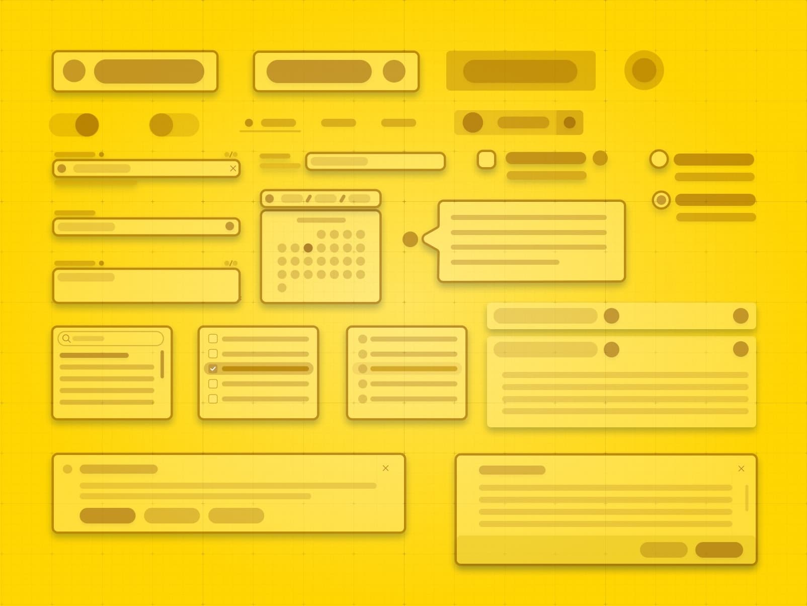
Define the containers in a component and the type of content that can be inserted into those containers. For example
- A Button has two slots
- Icon - Icon component
- Label - Plain (or HTML) text
- A TextInputField has these slots
- Label - Plain (or HTML) text
- Input - TextInput component
- Error Message - ErrorMessage component
- Hint - Plain (or HTML) text
The idea is to have a shared set of constraints that both Design and Engineering share, so we don't end up with the scenario where a component deviates enough from the design that the engineering effort to build it is larger than anticipated. This is similar to slots in web components or props in React.
The design tokens that are related to this component. Having them easily accessible will make it easy for the developer to ensure that they are using the right components.
| Token | Value |
|---|---|
--base-font-family | Inter, Helvetica, Arial, sans-serif |
--button-primary-background | gold |
--spacing-1 | 1rem |
These are all the different variations that a component has. For example, in the case of a button
- A Button can be of type primary, secondary, danger, etc, can have an icon on the left or right, can have a size of small, medium, large
- An autocomplete dropdown can be single select, multi select, can have simple text options of complex html options, can be one column, two column, etc
The various states that a component can be in its life cycle. For example
- A text input can be in a focussed, disabled, error, etc states
- A button can be in a disabled, loading, hover, clicked, etc states
- A list can have an empty state, paged state (when there are items that don’t fit in one page)
- An autocomplete input can have an empty state, few results state, too many to display results state (UX to display some and indicate there are more), no results state
- A list with search can have an empty state, paged state, no results state. Maybe we want to have a CTA when it’s empty and a different CTA when there are no results, etc
How should the component react to actions performed on it, what are the possible/allowed states it can transition to from a particular state. For example:
- If you click on a button with an icon and it’s performing a background async save, it should go into the loading state which disables the button and changes the icon to a loading icon
- How do we handle an array of text input with validation rules like items cannot be empty or items cannot have duplicates, what are the possible interactions and how should the component react and show error messages
Are there animations in the component for state transitions (enter and exit) and initial load and when exiting? For example, should a modal pop up from the bottom or fade in from the center or pop up from the element the user clicked to launch the modal. Similarly, when you exit, how should the exit transitiion be animated?
How do we handle the various inputs that change the component behavior? What is allowed and what is not allowed? Some examples are
- How do we handle large text that does not fit in a button, do we include tooltips, etc on a button when long text is truncated
- How do we handle an array of text inputs when there are 5 items versus when there are 100 items
- In a number input, do we want to set a max value or a min value, so users don’t enter negative numbers or comically large numbers
Do we need to support translations? If we do, some examples of the components, UIs with inputs in different languages and language directions (RTL) like German, Chinese, Arabic, etc should be shown in the designs. It is important that these are documented in Figma as well, so these are taken into consideration in the designs
Does the UI need to be responsive, i.e., work on mobile screens or optimized for ipads. What are the breakpoints we are assuming in our designs (make these into design tokens) and what changes in the design when the viewport size is different. What are the items on the screen that are critical and what can be hidden or added behind a control that the user can click to access
Does the UI need to take into account mouse and touch interactions? On touch devices, there are no hover or focus modes or keyboard interaction, so hints in tooltips that open on hover will need an alternative UX for touch devices. Do we need to add additional indicators or confirmation dialogs on touch devices? How does the look and feel and behavior change?
What to use it for and what not to use it for. Some examples are:
- A list input component may be used for 10 items, but not more than that.
- A number input may be used for integers, but not for fractions
- A button label can only have 120 characters and not more than that
Accessibility considerations, keyboard navigation, focus order, colors contrast, color blindness, etc. A UI should be entirely navigable using the accessibility tools available for a platform. It should have sufficient color contrast, you can alternatively provide a high contrast theme that the users can switch to, if they need to. Do not rely on just colors to indicate different variations and states of a component, add a visual indicator like an icon or text for folks who may not be able to see all the colors.
Add some screenshots of the component in the app, so it provides the context on how the component will look inside the app
Links to designs or screenshots or articles that were used as reference for this design. This will help understand the rationale behind the design and give some context to discuss priorities and tradeoffs regarding the requirements. It also provides some social proof and guidance for implementation based on how other organizations are solving the same problem